- are they single or double pages?
- the layout of the different elements on the page
- the different sections of the magazine that are shown on the contents pages
- the actual content - what can be found inside the magazine?
- the use of typography - font, size, use capitalisation/lower case, text direction, etc
- the use of images
- the use of page numbers
Sight and Sound
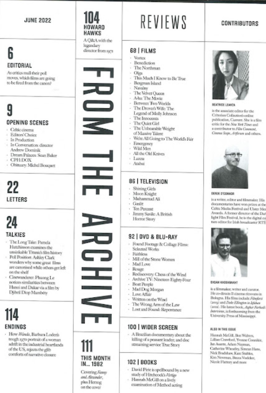

The content pages for Sight and Sound are double-sided (the images shown are from different editions). The layout stays consistent for both editions, having 'FROM THE ARCHIVE' and page 104 mainly centralised. 'REVIEWS' Is also in the same place in both, and the 'CONTRIBUTORS' section is also in the same place. The sections are the same in both editions, having 5 sections on either side of the 'FROM THE ARCHIVE'. The magazine offers discussion on movies, as well as reviews for different types of consumable content as content. Every title is capitalised, and the content is in lowercase. The 'FROM THE ARCHIVE' copy is larger than the rest of the font and is facing north to south. All copy is black. The images used are closeups of people and have been converted to black and white. Finally, the content page uses page numbers conventionally as the number relates to the content shown. Overall, the content pages of Sight and Sound follow the conventions of a content page.
Little White Lies


The content pages for Little White Lies (LWL) are single-sided. The composition and layout on both editions are very minimalistic, as there isn't much apart from the copy which is centralised. The sections are the same for both editions. Both offer 9 sections for different content in both editions. Some of the content is focused on the feature movie of the edition, but it also offers reviews and deeper looks into movies. The typography is simplistic and follows conventions as the the content is smaller than the sections. The colour of the copy is yellow in the Pink Flamingo edition, which compliments the black background. The colour of the copy is black in the Glass Onion edition, which also compliments the light blue background. There are no images used in either edition of LWL, apart from a tiny bit of ilistration which ties in with the front cover. The use of page numbers is also conventional as it directs the consumer to the page with the content on.
Film Stories
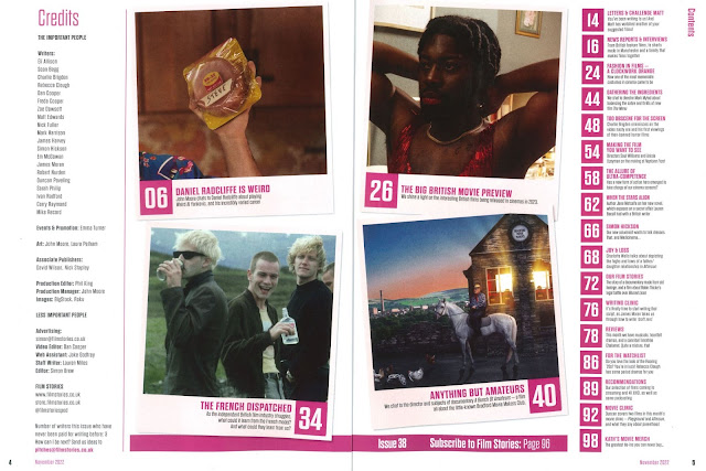

The content pages for Film Stories (FS) are double sided. The composition and layout is different to the previous two magazines. There is content in the middle with credits on the left and more content on the right. There are 21 sections of content in the magazine, and it offers reviews on movies as well as deeper looks into movies. It also offers recommendations, previews of movies, and letters set in by fans of the magazine. The font is conventional like the previous 2 magazines as the copy for content is smaller than the different sections. The images used highlight different pieces of content, and the first image usually corolates to the main cover. Like the other two magazines, FS uses page numbers conventionally as it directs the consumer to the different pieces of content.